

Data Visualization and Landmines
I thought I was familiar with data visualization. In the past I've used databases like SalesForce, as well as programs such as Quickbooks and the microfinance-geared Mambu, to produce financial and indicator reports. Each of these programs was capable of aggregating data and presenting it in a visually digestible format to tell a story, but the story never varied. Reports were designed to show current program/organization status on its own or as compared to past performance and future progress.
Data visualization at Open Development Cambodia is very different. In writing my pages for the website, I have to produce visualizations that both fit into the overall narrative of the page and tell a story in their own right. It is essentially the art of storytelling but with numbers instead of words.
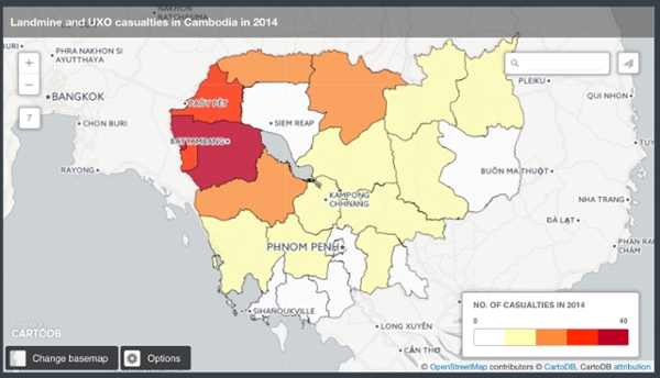
For example, one of my pages is about landmines and unexploded ordinance (UXO) in Cambodia, one of the most mine-affected countries in the world. Unexploded ordinance first became an issue due to U.S. bombing campaigns of Cambodia associated with the Vietnam War. Landmines then became prevalent following the ouster of the Khmer Rouge. After driving the Khmer Rouge across the Thai border, the Vietnamese military enlisted local people to lay landmines in the area as a defense. Subsequently, the Vietnamese government and the Khmer Rouge and monarchist opposition forces continued to lay landmines against each other. Since 1979 there have been more than 64,000 casualties. Though the government and NGO partners are working to rid the country of landmines by 2019 and casualties have declined significantly, casualties are still highly concentrated in provinces along the Thai border.
Clearly geography is key to understanding the problems associated with landmines in Cambodia and should be reflected in my data visualizations. Fortunately the Cambodian Mine Action Authority is one of the few organizations that diligently publishes data, and so I was able to fine the number of mine casualties that occurred in each province in 2014. The difficulty was in finding a format that accurately demonstrated the relationship to geography. A bar graph was insufficient; though researchers familiar with Cambodia might be able to identify the connection from the province names, others would not. My only option was a map, and that meant learning to use an entirely new program.
I am not a technologically literate person considering my age and the era in which I grew up. Though I've taught myself to use many programs and can troubleshoot with proficiency, I don't necessarily understanding the underlying concepts that make my use of a computer program possible. Understanding was essential to using the mapping software at my disposal. The program's tutorials and assistance assumed a certain level of familiarity with mapping that I do not possess. At first I could not figure out how to map the polygon shape of each province, and later I struggled to merge that spatial data with my own data on casualties. After two weeks of trial and error in my spare time, I finally managed to produce a map that displayed Cambodia's provinces and their relationship to landmine casualties.
In celebrating that success, I it would have been easy to overlook the smaller details that are essential to effectively communicating a story. Gradations of color, an accurate legend, the wording of the title, and the position of the variables in the text boxes that hover over each province must all painstakingly be considered to ensure that the viewer can easily comprehend the full image and story.
Though mapmaking is not a necessary skill in the wheelhouse of a typical lawyer, the ability to tell a story is important. The process of making a map gave me a new means to use that skill.
Of course, I don't know how to embed it, but here is a link: http://cdb.io/1ID2DPr